Role: Product Designer
Timeline: 2 Month (July - August 2019)
Team: 1 Product Designer, 1 Developer
*I was the designer that picked this project up after it was started for StarterHacks 2019.
StarterHacks is a weekend-long tech competition focused on beginners where students can come together to build a product and pitch their ideas to judges. Mentors are present throughout the entire weekend to offer guidance and support for the first-time hackers. Students can reach out to mentors for assistance in three streams: development, design, and business.
For hackers to reach out to mentors for help, there is a dedicated channel within the hackathon wide Slack workspace where hackers can post their problems. Available mentors can then browse through the help requests and contact the hacker through slack. With over a thousand attendees, this channel can get cluttered and disorganized very quickly. Mentors get flooded and whether or not a hacker has been attended to is unclear.
How might we connect hackers who need help to the right mentors in a simple and organized way?
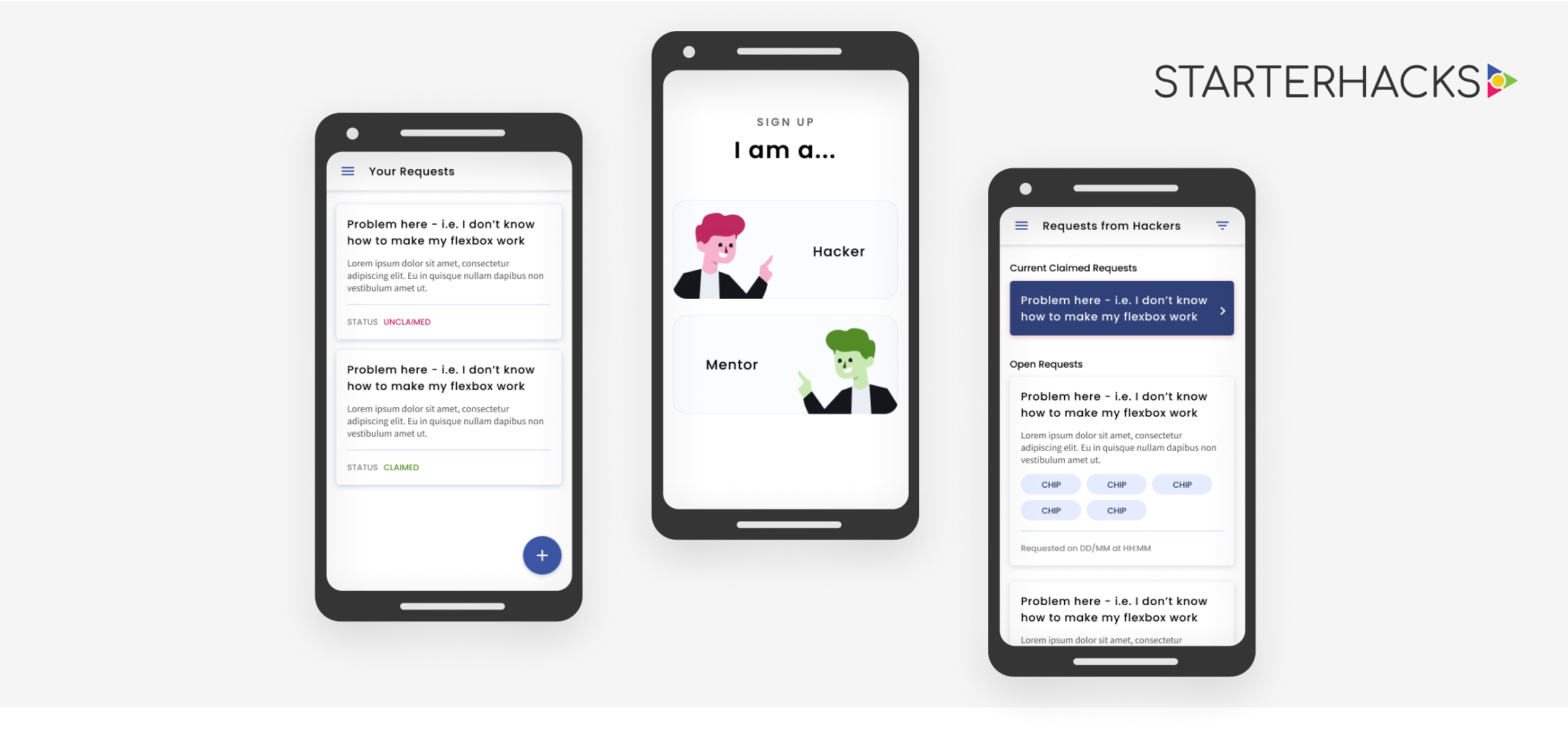
For StarterHacks 2019, the organizing team quickly created the Mentor Paging App. There are two types of users: hackers and mentors. Through the Paging App:
I took over as the product designer for the app after StarterHacks 2019 had concluded. My focus was to iterate and improve upon the existing app as well as work closely with the developers to ensure that the app can be developed in time.
Google Material Design was used for wireframes so that the marketing team could just stylize the components with the appropriate colours and fonts.
The user flow and information architecture was created with tech feasibility in mind. It was a tool for communication between the developer and I to understand where the large amounts of information was being pulled from and where it is being displayed and used.
There are separate flows for the hackers and mentors but information is being passed between the two as they share the same database. Users will be presented with a different view and different functionalities depending on if they sign up as a hacker or a mentor, thus requiring a different user flow for each.
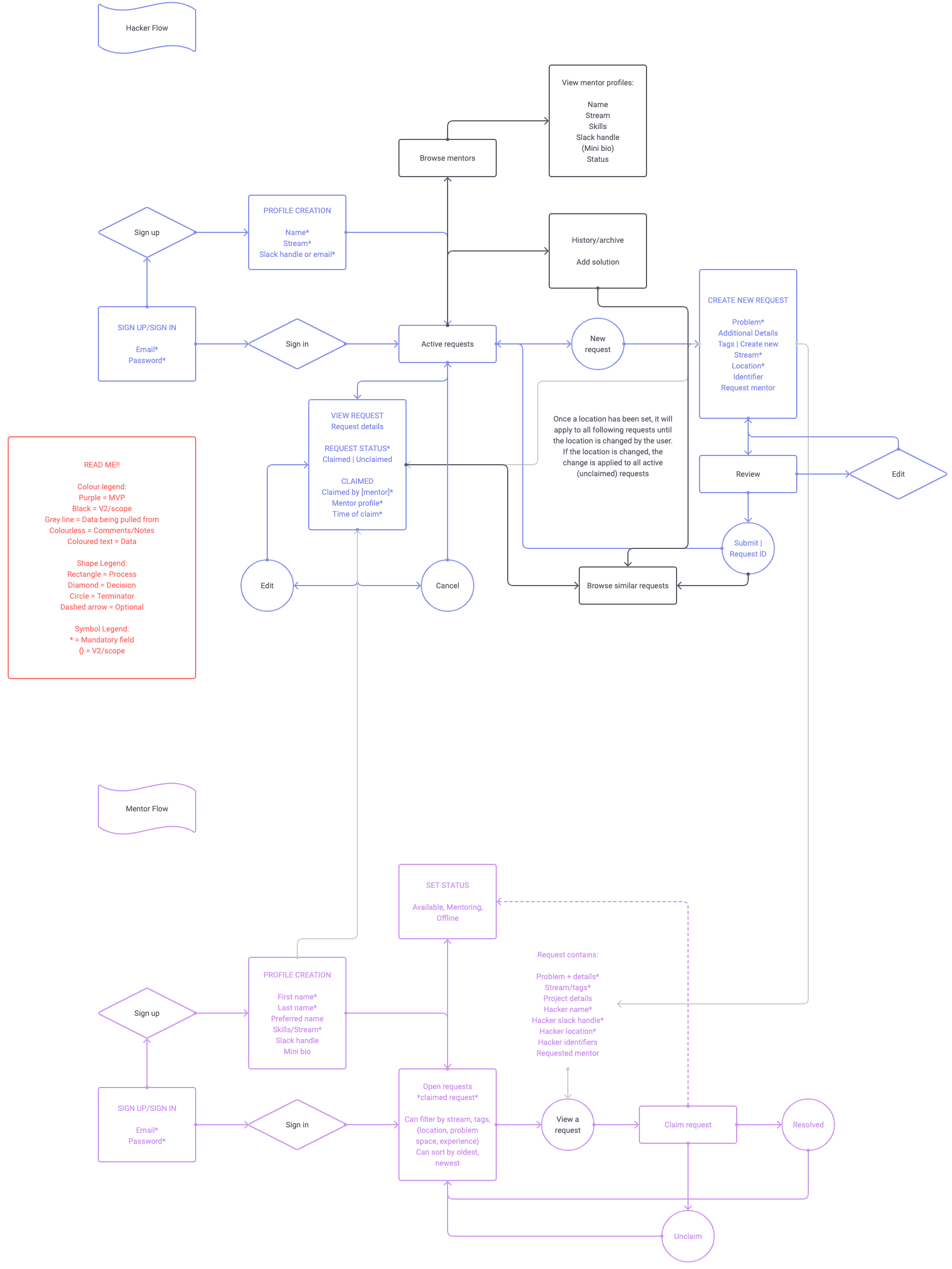
Within the flow, details pertaining to the type of information that would need to be stored is document as well as its origin. There are also notes made for the developer indicating behaviour.
I interviewed a few hackers and mentors from StarterHacks 2019 to learn more about their experience with the first iteration of the paging app.
Pain points:
For the MVP, we added the ability to edit or delete a card even after it had been submitted in addition to the creation of a new help request to give users more autonomy and flexibility. It keeps the requests in the pool relevant and up-to-date. Clutter is reduced by allowing hackers to delete requests if they were able to solve it on their own after submission.
Edit and Delete functions added for user automony
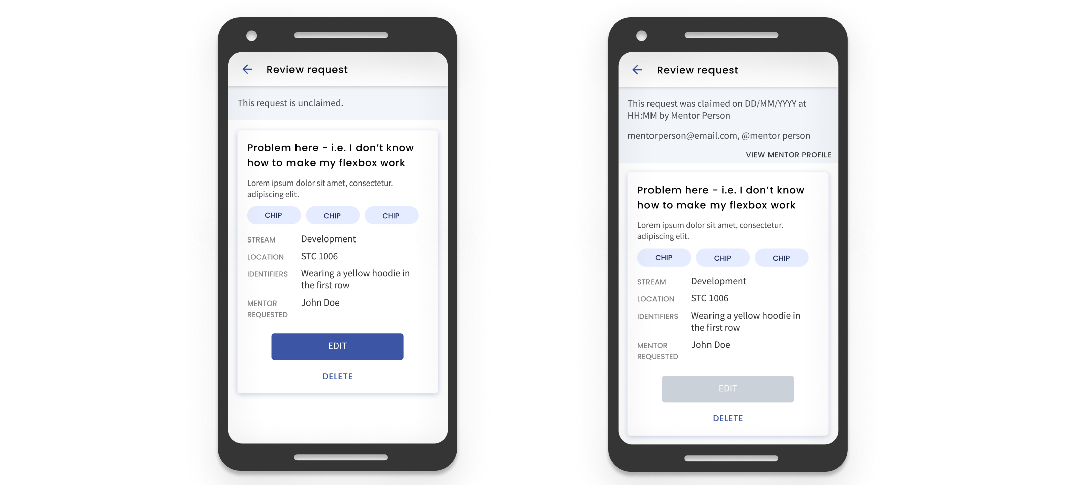
Hackers can also see the status of the card so that they know if a mentor has seen it and is on the way to help them so that they can remain informed without their email inbox being blown up. If a card has been claimed, the hacker can also view the mentor’s profile (as shown above) to get a little background and contact information to help nurture hacker-mentor relationships.
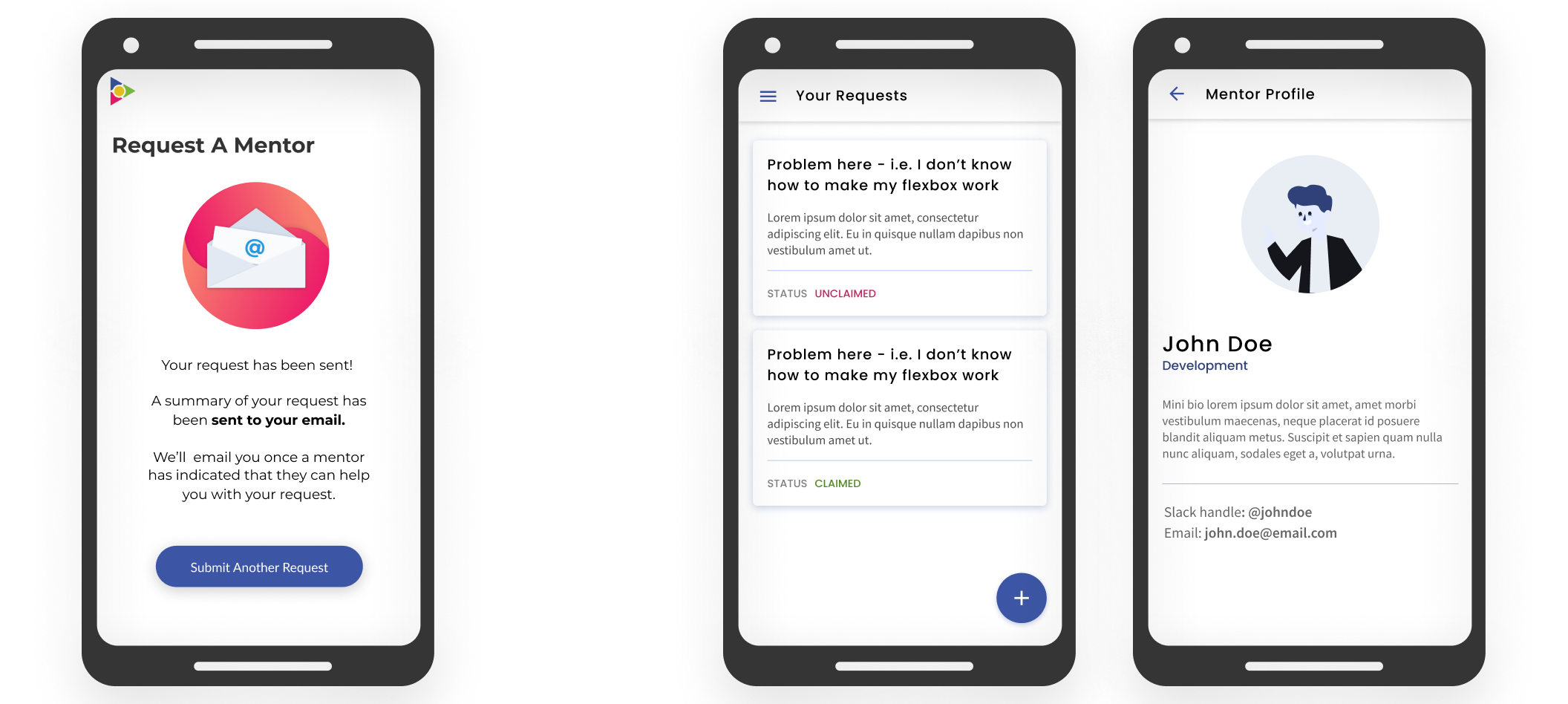
Left: 2018 screen after request submission. Right: 2020 status of requests and viewing a mentor’s profile after a request has been claimed.
The onboarding process was modified to include a profile creation upon sign up. Here, hackers can input their contact information which is then attached to each request that they create. Working with the developer, we made so that certain information is saved (ex. Hacker’s current location) and pre-filled each time and if the user were to change that information, it would be pre-filled with the updated information in future request creations. This change in the backend allows users to enter certain information only once and easily update information that changes semi-frequently.
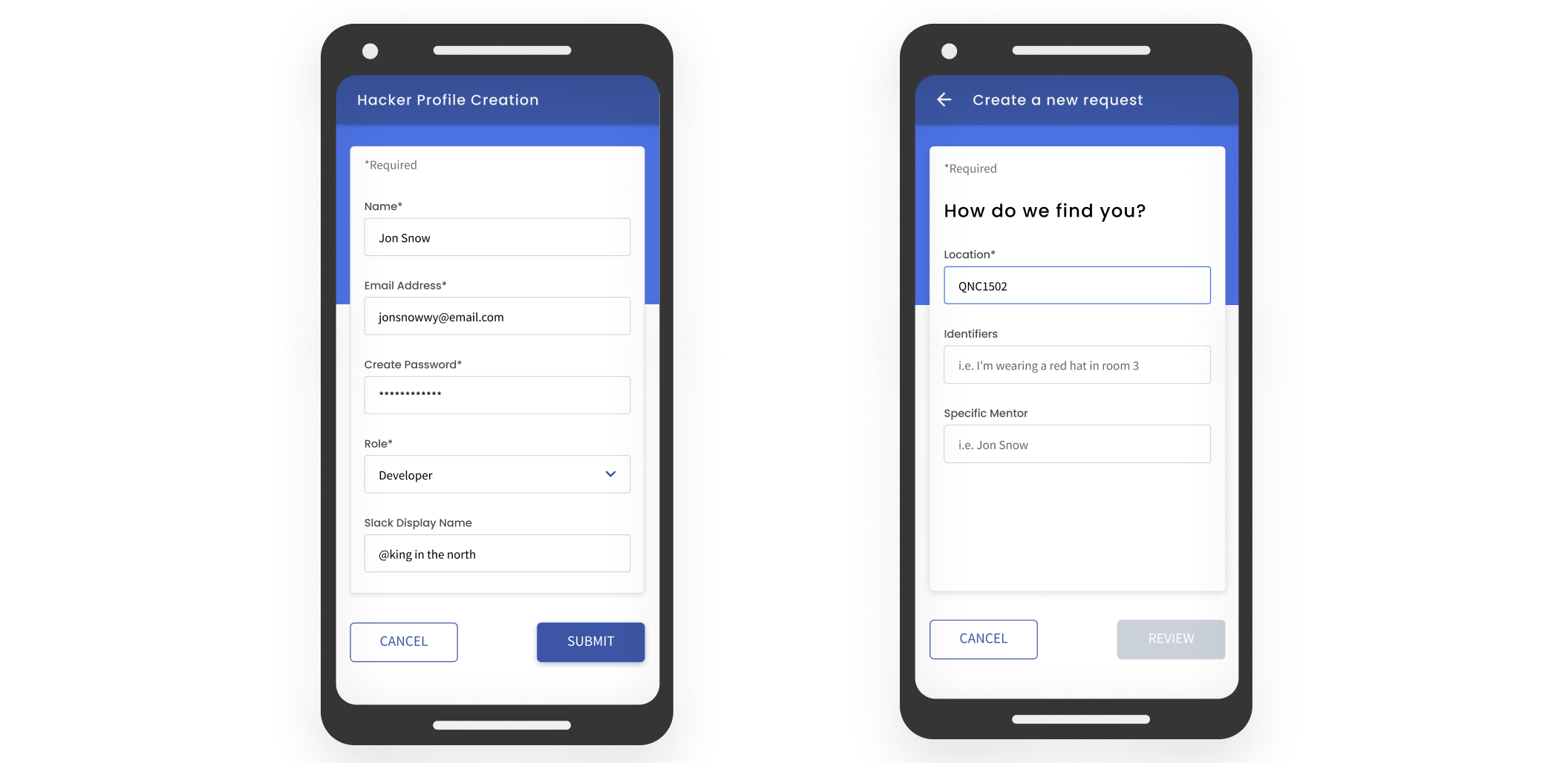
Left: Hacker profile creation. Right: Location field is pre-filled based on what was last inputted in the previous request.
Pain points:
In the 2020 iteration, there are no longer two tabs where the request pool and claimed request lived separately, the claimed ticket is pinned to the top of the screen and the pool continues to scroll beneath it. This reminds users of the ticket and prompts them to attend to the hacker rather than have it easily forgotten in a separate tab. It also makes the navigation simpler.
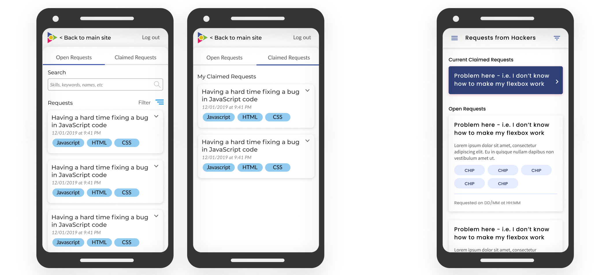
Far Left: 2018 Request pool and claimed request tab. Right: 2020 Mentor home screen; claimed ticket and request pool
The search functionality was removed as the users indicated that it wasn’t of any use to them. The filter and sort function was kept as users noted that it was more practical since the requests can be bucketed together into their streams in an organized fashion.
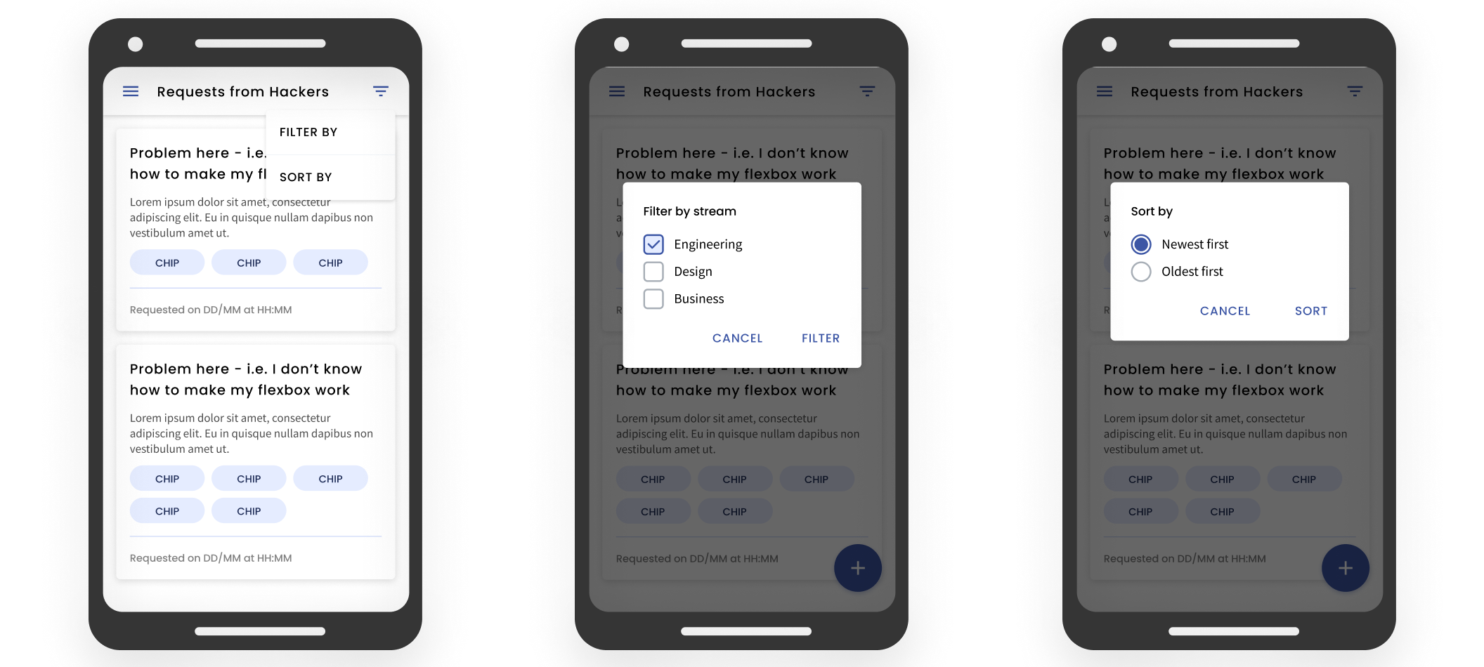
Filter and sort by functions
Mentors also got their own profiles where contact information can be stored and linked to each card the claimed (similar to the hacker side with request submission). Additionally, the mentor is able to view the hacker’s profile via a request card and the hacker can view the mentor’s profile once their request has been claimed. This helps connect hacker to mentor in a much smoother and simpler way.
We tested with frequent hackathon attendees (hackers and mentors) as well as users who were at StarterHacks 2019. There were two common points of confusion regarding both views:
Users were most frequently confused by the use of the terms “stream” and “slack handle”. Stream is what StarterHacks uses to refer to the role of the hacker (development, design, or business); the confusion was easily cleared up by changing the input format to a dropdown. For “slack handle”, the input tag was changed to be more descriptive: “slack display name”. Additionally, I used placeholder text to provide examples of what information belongs in that text field. Field label was kept outside of the field to lessen the short-term memory load on the user. Adornments were used to help guide the user towards the correct input format.
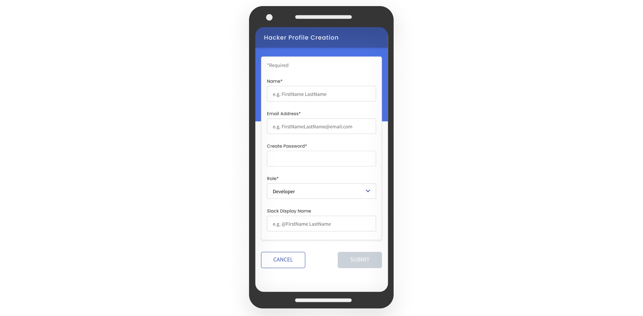
Placeholder text and adornments
Users were also confused by the sign-up process. They were unsure of whether or not they needed to input an email and password on the landing page if they wanted to sign up as the login and sign-up buttons were similar. To address this pain point, I changed the landing page so that the user is choosing to either sign-up or login without having to input any information yet to make the two flows more distinct and separate.
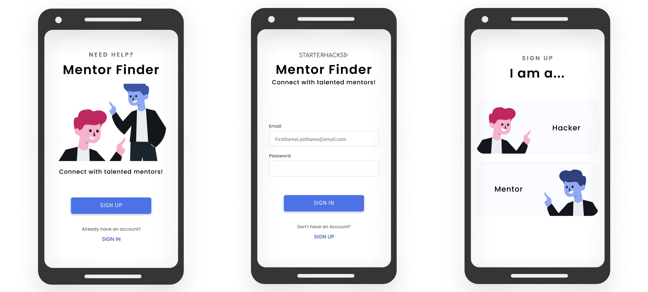
Distinct separate flows for signing up and signing in
Some users found the request creation form to be a bit long. All the questions on the form are necessary, so I broke up the form into sections with their own headers (information about the problem and how to find the hacker) to help keep the user focused and make the form more digestible by having bite size, similar themed sections.
Users struggled to find and use the filter function and often resorted to process of elimination to figure it out as a result of the icon representing it being unintuitive. This was easily addressed by changing the icon to one that is familiar to users.
Dev Collaboration + Interaction Design
I had to work and think in a different space and work under different
constraints and considerations on top of good design principles. It
highlighted just how important communication is and how critical it is
for designers to be able to understand dev language and to communicate
effectively to someone who doesn’t speak design. Working this closely
with a developer strengthened my interaction design skills as I
thought less about how things looked (especially since the branding
team would take over for high-fidelity) and more about what goes on
behind the scenes.
Usability Testing
Usability testing I learned very quickly that 90% of the time, my
assumptions are wrong. It really taught me to get out of my own
designer head and step into the user’s shoes. I learned how to
formulate usability testing questions and how to turn the results and
insights into meaningful design decisions.
Scoping + User Testing
I talked to various stakeholders before I designed anything; hackers,
mentors, StarterHacks organizers/founders, and previous designers.
Juggling the needs of the users (hacker and mentor), business goals,
and tech feasibility really challenged my product thinking skills.
There were a lot of tradeoffs and if I could re-do this part of the
process, I would have started off with a much smaller scope and then
adding as the project progressed. This made me a much more flexible
and adaptable designer who is able to make compromises and come up
with alternative solutions.
This project is far from done; there are so many other exciting features that have yet to be flushed out that will help connect hackers and mentors (but that’s a StarterHacks 2021 project). I am proud of the work that was done for the MVP (particularly the information architecture) but I would have liked to contribute more to the visual design and do some prototyping. With a longer timeline, I would also do more rounds of usability testing and explore how this project can be more than just a mentor paging app; how might it really be an asset in a hacker-mentor relationship?